
CLS, standing for Cumulative Layout Shift, is a score given among the criteria of Core Web Vitals which you can find after an analysis using the Google PageSpeed Insights tool. The CLS measures the shift of elements during page layout. If an element moves while the user is interacting or not, and this potentially risks degrading their experience, Lighthouse (the measurement tool behind GPSI) will increase (negatively) your CLS score.
In this guide, we will explore CLS, seeing how to understand it, analyse it, and then improve it.
What Is Cumulative Layout Shift (CLS)?
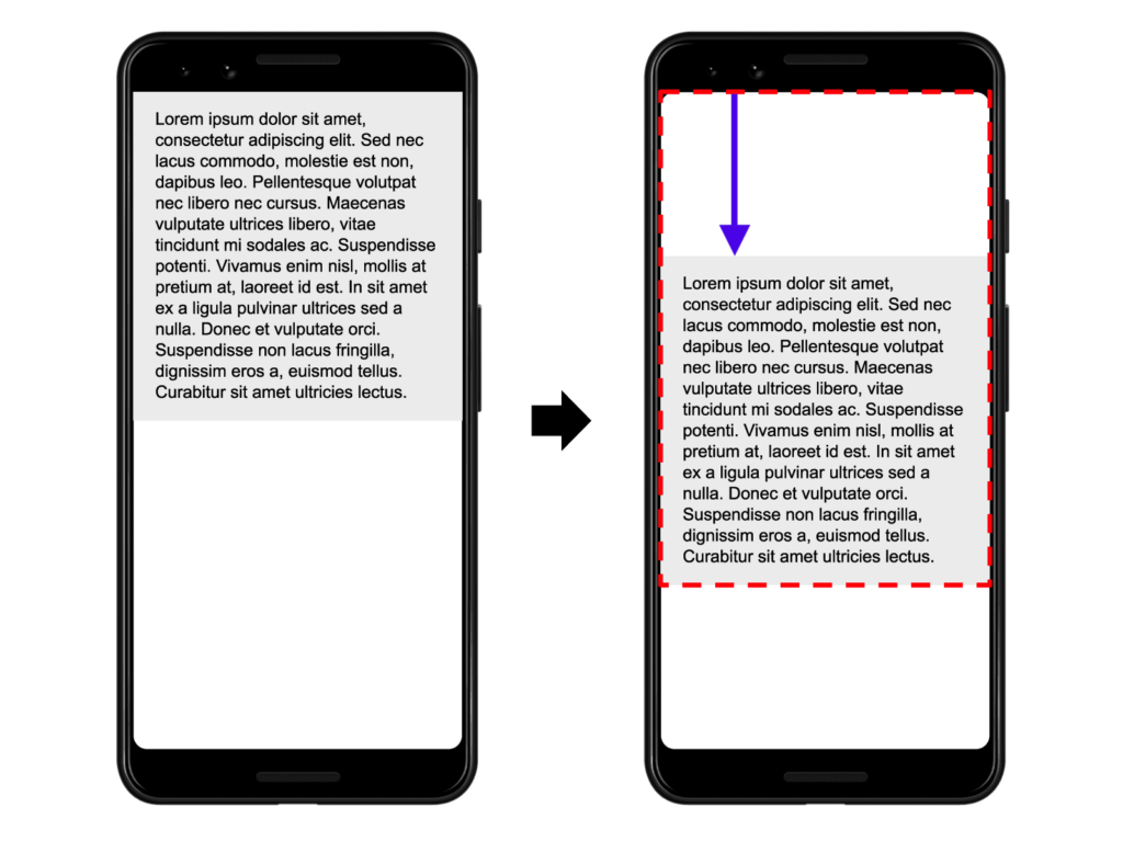
A layout shift occurs whenever a visible element changes position from one frame to another:
CLS is when you are about to click a link, the entire page shifts and you click on a different link instead. It is when you are halfway through a blog post, an ad loads and you lose your place. In short, it is when the layout changes. Or rather, that is what it tries to measure: both those changes, how often they occur, and the irritation this might cause the user.
Understanding Your Google PageSpeed CLS Score
It can be frustrating to understand these rather simple concepts while not understanding why GPSI gives you a high CLS score, given that it is not always possible to visualise the problems. Indeed, depending on your connection — for example if you have fibre — a page may load instantly and you wonder why the Lighthouse tool (the tool behind GPSI) gives you such a poor score. There are also other reasons, such as a layout shift that may be complete before you scroll down the page. You therefore cannot always see everything without using a tool.
For this, there are many ways to analyse CLS frame by frame to better visualise the elements concerned. That is what we will look at next.
Tools to Understand and Measure CLS
While there are many tools for measuring and understanding your CLS, for me the best remains webpagetest.org. It allows you to perform advanced analyses thanks to the many parameters available that you can specify before triggering tests — something impossible on GPSI, for example. Moreover, it is rather pleasant to work with compared to very technical tools like New Relic.
1. Google PageSpeed Insights
I advise against choosing the Google PageSpeed tool, which misleads more often than not. However, as time passes the tool becomes more refined — nothing stops you from starting with it. The fact that the list of all elements is rather friendly for novices or those who have a phobia of more technical interfaces is a real plus.
I do however want to clarify that GPSI performs tests from locations in “Europe” (yes, that is vague) and with a poor connection (slow 3G). So it is often very unhelpful to take into account the scores it assigns. It is better to look at the problems it has detected — those will not change. Indeed, the score itself attributed to an element is less important to take into account.
2. Chrome DevTools
If GPSI is not very precise, the Chrome browser is equipped with a feature to analyse your CLS more deeply. Included by default in the browser, simply right-click and press “Inspect”. Then go to the “Performance” tab, and click the small refresh icon or use the shortcut Ctrl + Shift + E to generate a detailed analysis of your website.

Here is what it looks like. The elements framed in red are the ones we are interested in.

To start, check “Web Vitals”. Then let us dive into the 2nd frame — the frame-by-frame screenshots. It will allow you to visualise step by step the potential shifts influencing the CLS of your page. However, you will need to look more closely at the chart as screenshots only capture the first layout — meaning CLS after scrolling will not be visible here.
You also have several cursors named “LP” for Layout Shift, indicating precisely in milliseconds that an event triggered a layout shift:
Finally, by clicking on the boxes named “Layout Shift”, Chrome will provide more specific details:
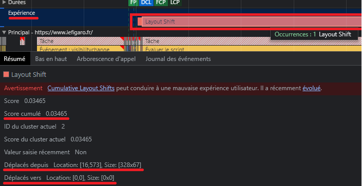
After clicking on a box, it is also possible to hover over the summary (locations) to visually identify the element concerned:
Note: We had not seen this element in the frame-by-frame screenshots, but this is relatively logical since we can see that the shift score for this element is relatively low. It is therefore barely perceptible to the naked eye, even with frame-by-frame screenshots.
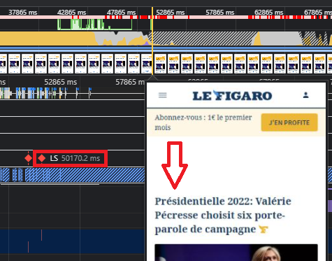
3. webpagetest.org
I strongly advise using WebPageTest, which is more often precise and also often easier to digest than Chrome DevTools. Moreover, you can choose a precise location for your tests, and even an exact connection speed among many other things. You can thus create tests much closer to reality, taking into account the reality of your users.
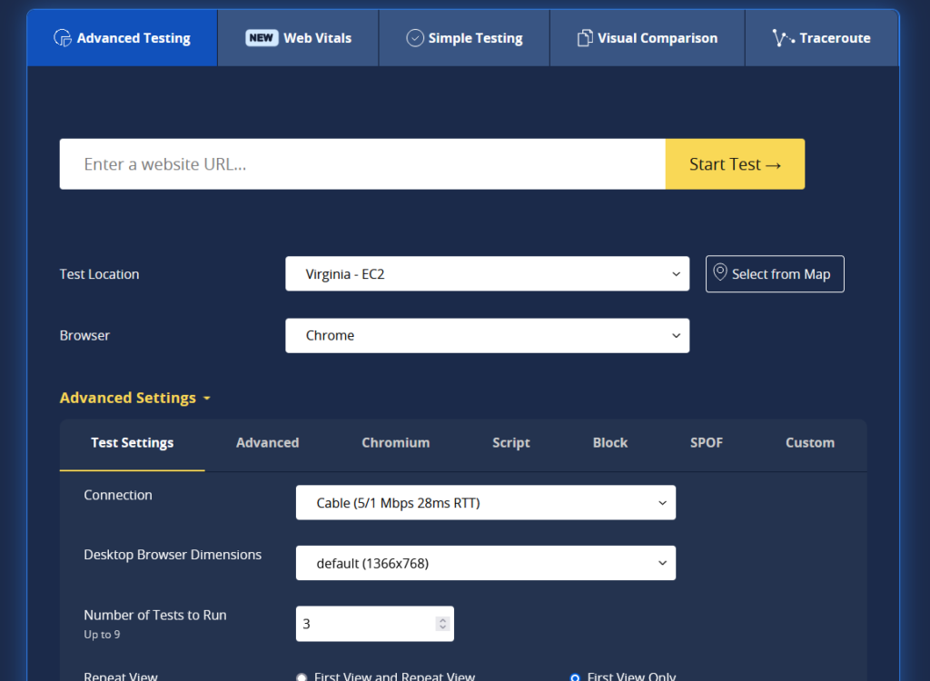
The first overall information the tool gives you is directly an average calculated over the number of tests you specified (3 if you changed nothing):

However, what interests us here is the “Web Vitals” tab — let us go into more detail:

Note: Depending on the parameters you assigned beforehand, the results can be very different from GPSI for reasons I have already explained multiple times (trust WebPageTest).
In this test, I used a slow 3G connection, with Paris as the location and not just “Europe” ;). If the results are somewhat different from before, even though I used the same bandwidth as GPSI, it is simply because I chose to look at CWV on desktop and not mobile this time.
By clicking on the CLS square — the middle one — you will be automatically redirected to the elements in question. You will then have a detailed view and access to an explanatory video:
If this does not match the same problem as before in Chrome, remember that we are on desktop this time — do not lose the thread! Here we can see that the layout shift element is the Christmas advertising banner. This is also what you can observe when I hover over the responsive image just before.
Improving Your Cumulative Layout Shift Score
Now that you have the tools and know how to use them, it is time to move on to optimising your site. This part will be particularly complex as I cannot guess the problems you will encounter. I will however try to cover all recurring issues. If you need help improving your Core Web Vitals and it seems too complex, or you do not have the time, you can simply contact me.
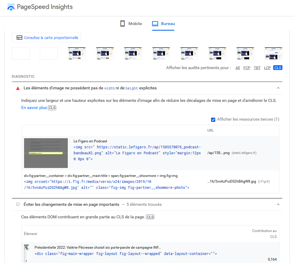
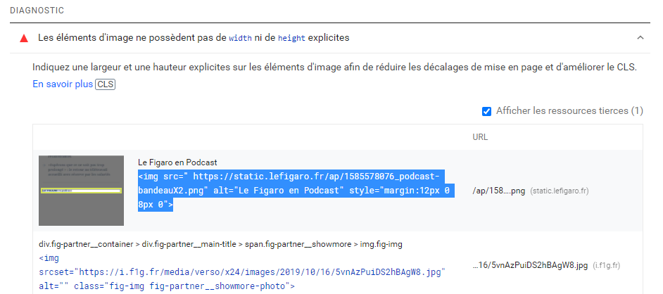
1. Image Elements Do Not Have Explicit Width and Height
This part is the most important to remember. It alone almost always triggers layout shift (or the highest score).
Indeed, if you do not allocate a defined space for your images and you use “auto” dimensions, the browser will load the ideal dimension by adapting the element during loading and will therefore shift the layout. For example, this CSS code is not good:
your-image {
height: auto;
}
Instead, the simplest method is to use the classic approach:
<img src=”your-image.webp” width=”800″ height=”400″ alt=”integrate webp format”>
You must give explicit values so that your images, iFrames, videos and other elements are correctly defined and no element shifts. Otherwise these elements will load and organise themselves based on their appearance on screen, which is, let us be frank, terrible.
To resolve this problem you can also define a ratio so that the image loads at the very start of the calculation:
your-image {
aspect-ratio: attr(width) / attr(height);
}
If it is possible to add the image in HTML without specifying its dimensions and using CSS specifying the exact image dimensions like this:
your-image {
width: 800px;
height: 400px;
}
You may still observe a CLS, even if it is smaller. This is explained by the fact that HTML is faster to load than CSS or JavaScript. Thus all your HTML will be displayed and the CSS line specifying the dimensions will not yet have been interpreted. So you will have the HTML display with an image of one dimension. CSS will then be interpreted and change the dimensions of the already-displayed image. You will therefore still have a layout shift.
1.1 Advertising Spaces
If your site uses advertising spaces such as Google scripts (external dynamic content), they are very likely to trigger significant layout shifts as they will automatically adapt to your page. Even worse if users use an adblocker. If the latter is interpreted after the layout, you will see ads appearing and shifting the layout, then disappearing and shifting the layout again…
So one of the most effective methods is once again to reserve explicit space for them.
But this can also concern other elements, such as an intrusive WordPress pop-up plugin, your GDPR cookie module, and others.
Remember that elements — whether images, dynamic content or others — that do not have explicit width and height are always the most significant layout shift factors and are often the sole cause of a very high CLS.
2. Font Loading
Preloading the font to avoid a “FOUT or FOIT” font is probably the 2nd most frequent criterion for Layout Shift. GPSI might indicate this message to you: “Ensure text remains visible during webfont load”.
If your font is not preloaded, the HTML code will display a fallback font before interpreting the assigned font. Given that a font can easily be twice as large or twice as small as a fallback font (“FOUT”: unstyled text), you will observe a significant shift between all elements while the font is being defined. The font can also encounter a problem and be invisible until it is resolved — in this scenario the font will also be displayed in the fallback font.
To address these problems you can use these 3 methods:
- Display fonts using “optional”. The code: font-display: optional
- Preload fonts. The code: <link rel=”preload” as=”font” href=”/fonts/my-font.woff” type=”font/woff” crossorigin=”anonymous”>
- Use system font stacks directly. The code: body {font-family: -apple-system, system-ui, BlinkMacSystemFont, “Segoe UI”, Helvetica, Arial, sans-serif, “Apple Color Emoji”, “Segoe UI Emoji”, “Segoe UI Symbol”;}
Note: Never call a font in CSS using the @import rule!!
Summary: Optimising Your CLS
A quick recap of what we have covered throughout this article. Chrome, GPSI or WebPageTest show you precisely the piece of code concerned that is causing the Layout Shift, making it very easy to identify the causes of the problem:
All you have to do is modify this element and add explicit width and height in the HTML code, and that is it. That is precisely why we looked in detail at how to use the tools: they will be invaluable! It is not as complicated as it seems!